She lives in a medium-sized city in Germany, she brings her kids to school, and sports, drives to work, drives shopping, and to visit friends.
She couldn’t do all this without her car…
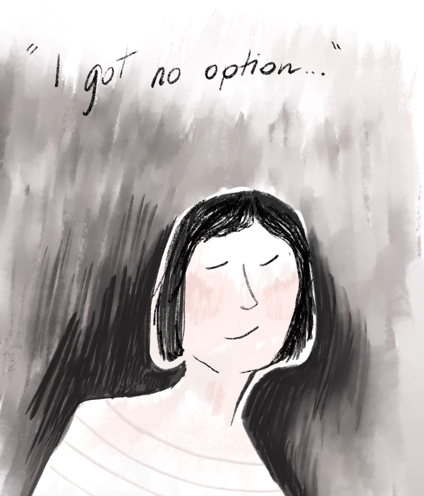
She would like to be more environmentally conscious and at the same time to be more involved in the improvement of her city’s ecological improvement.
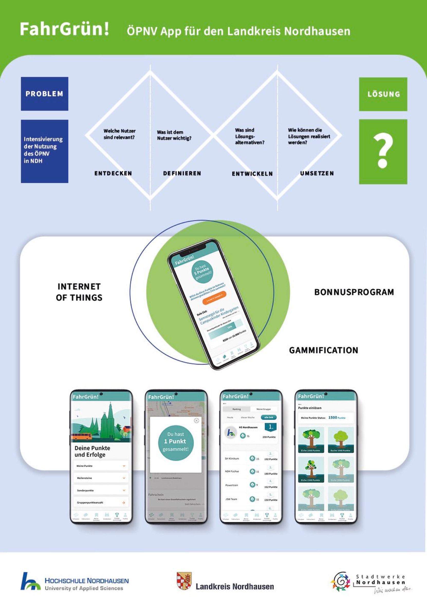
THE PROBLEM
Overall, the combination of limited coverage, fewer options, lower demand, and greater car ownership make it less convenient and less necessary for people in small cities to use public transportation as a mode of transport.
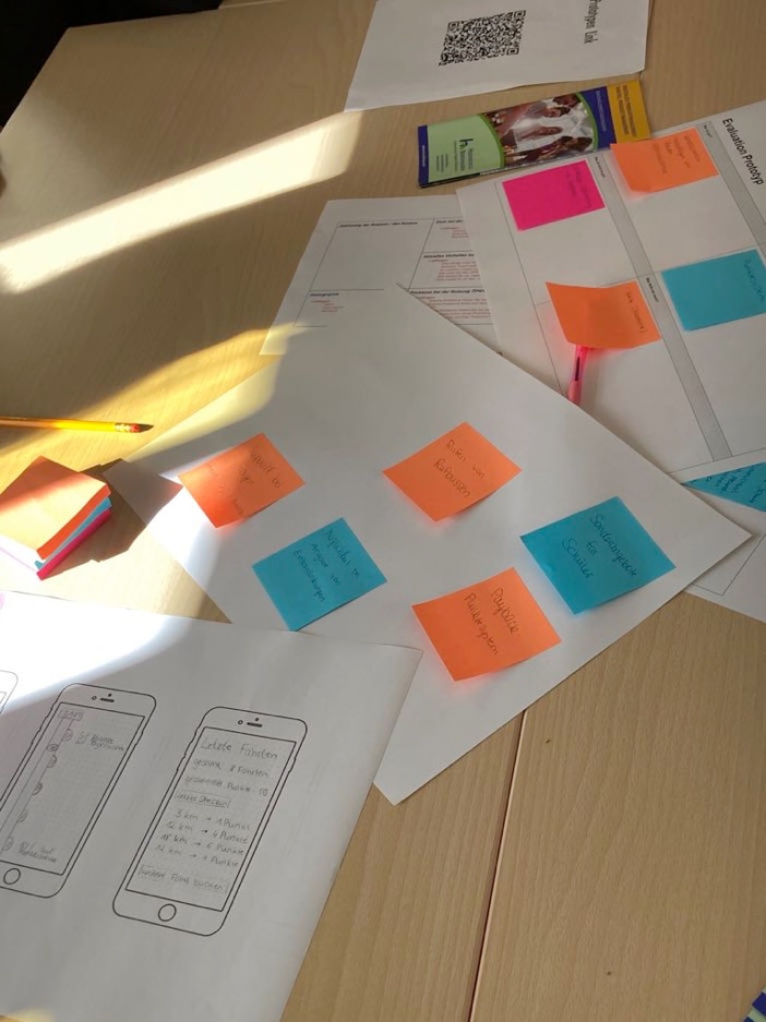
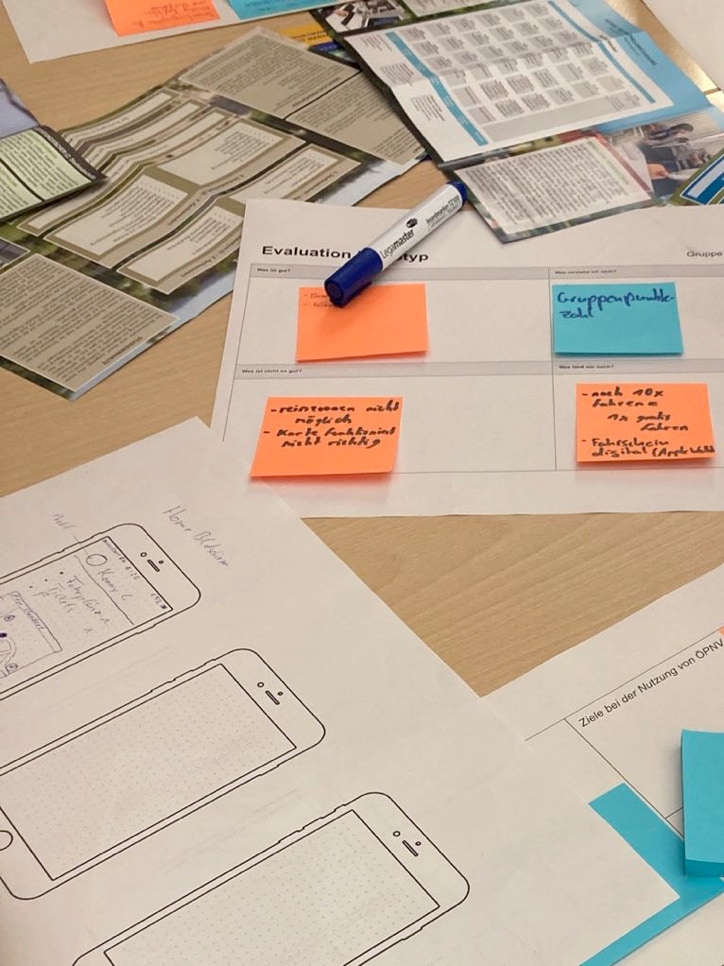
After researching the diferent reasons, the conclussion was to increase the number and frequency of current users and provide a reward program hat benefits different social projects.
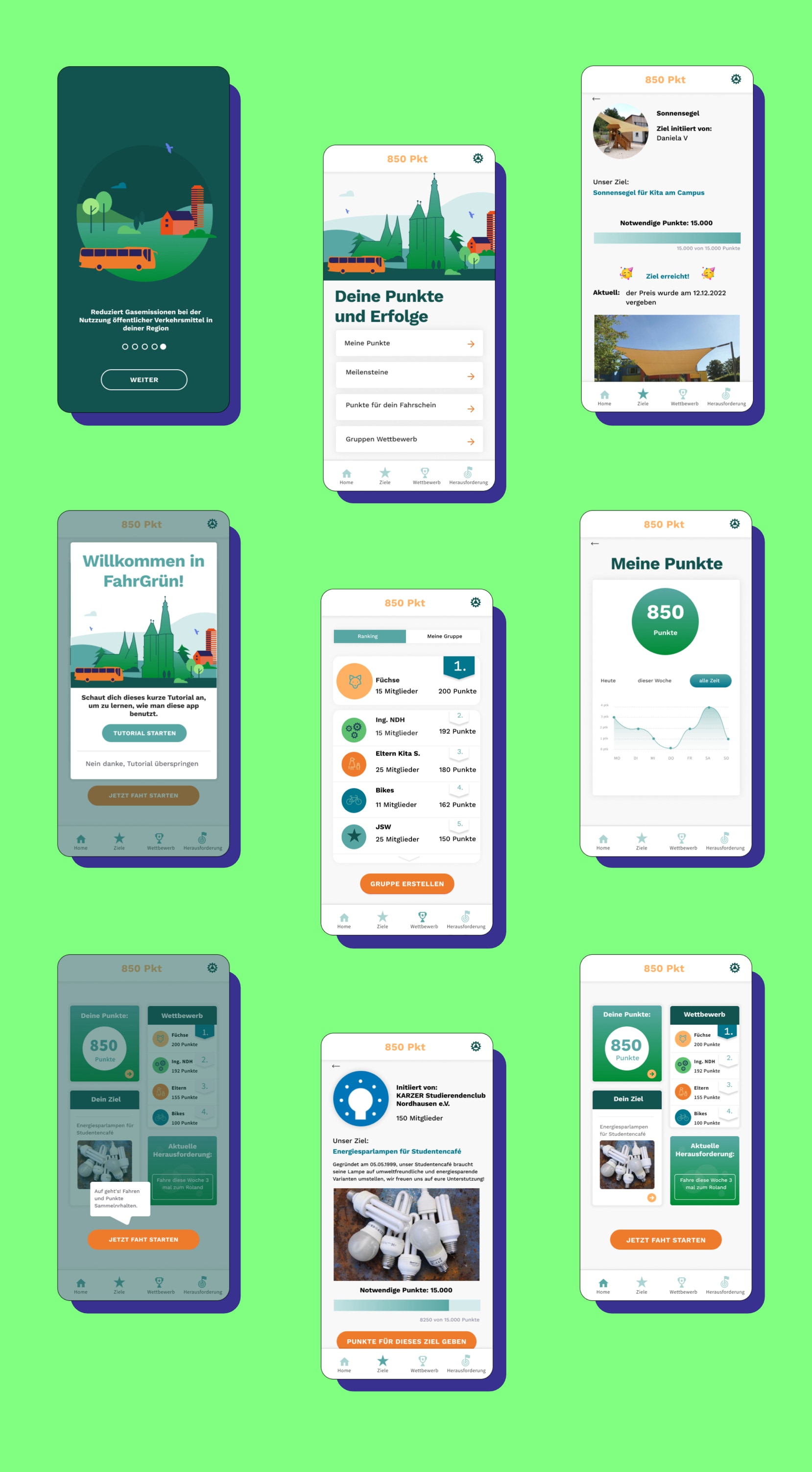
Project Description
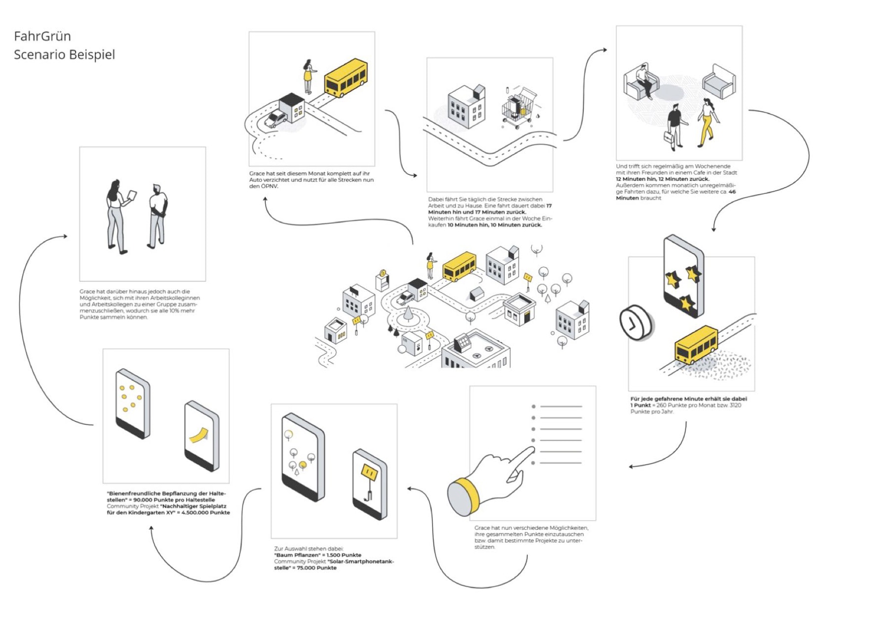
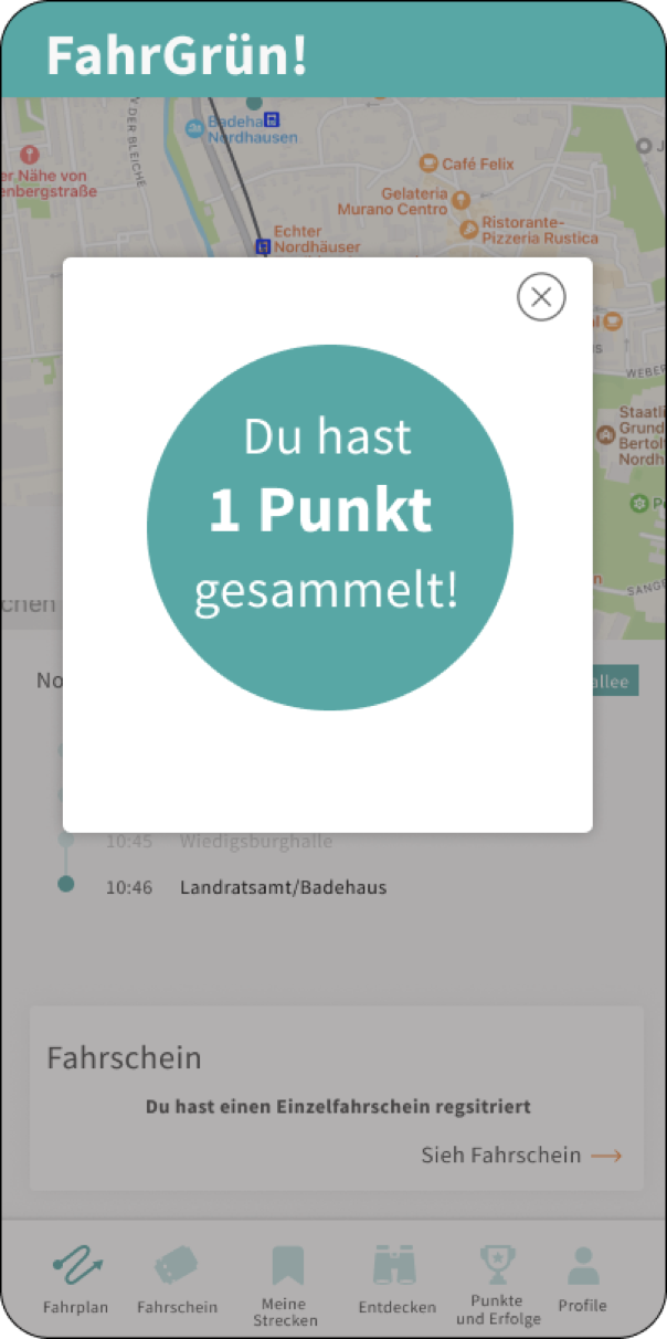
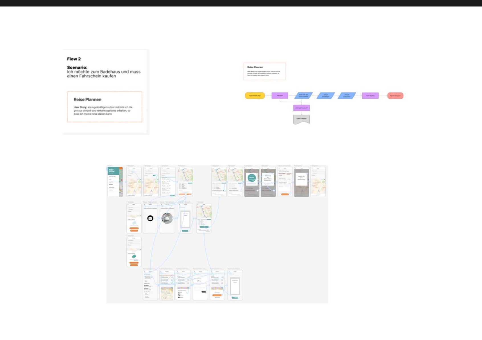
FahrGrün! is a gamification app that rewards users with points for each ride they take on public transportation. The app was developed to encourage more people to use public transportation and reduce the number of cars on the road.
The app uses a point-based system where users earn points for each ride they take. The number of points earned depends on the time traveled and the ticket they have purchased.
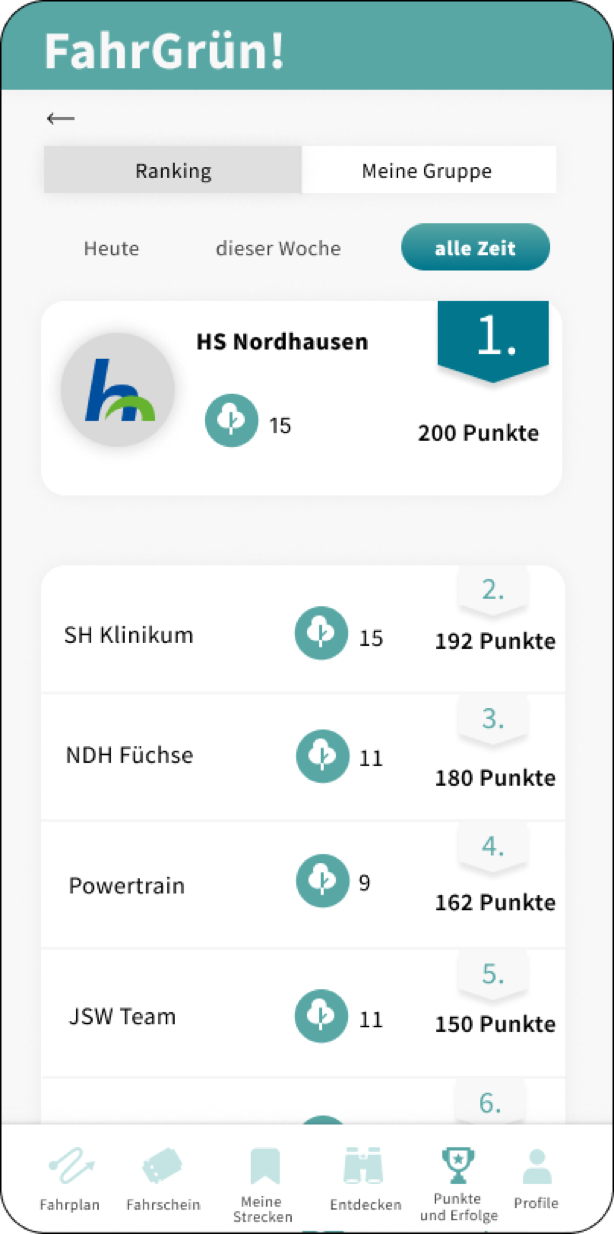
The app also includes a leaderboard that shows the top group of users with the most points. Users can compete against each other to see who can earn the most points and climb up the leaderboard.
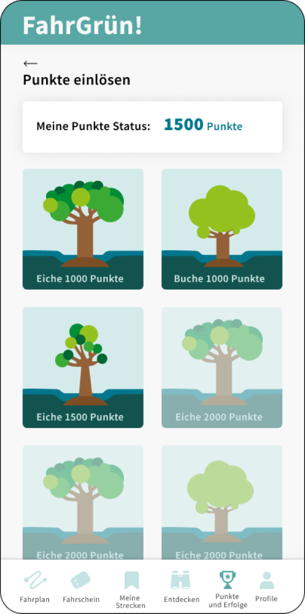
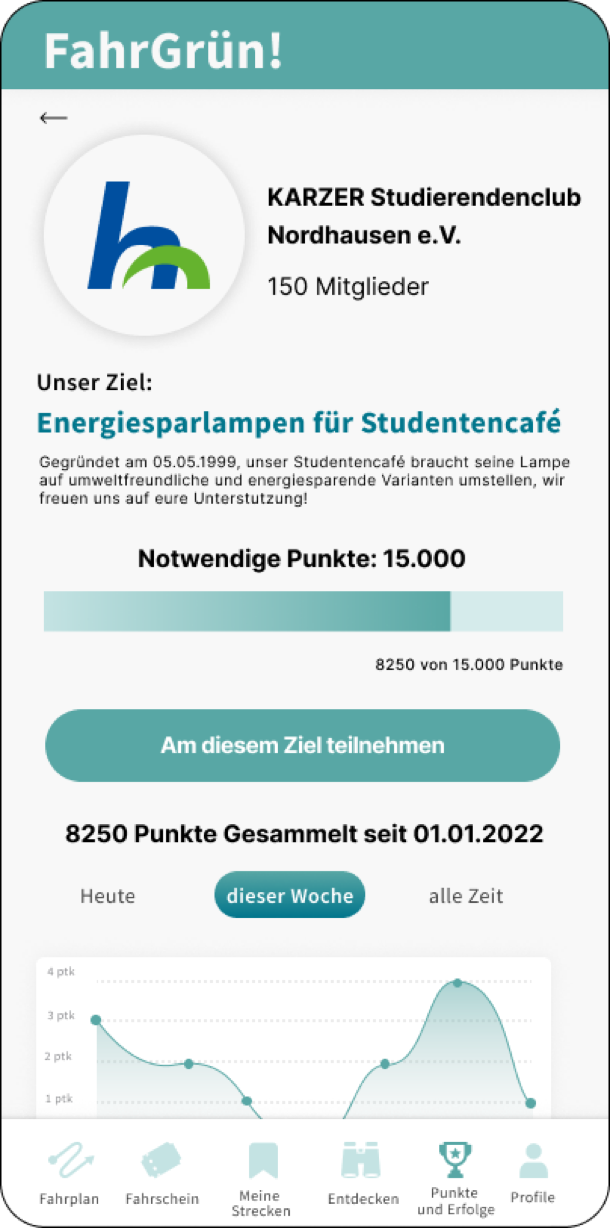
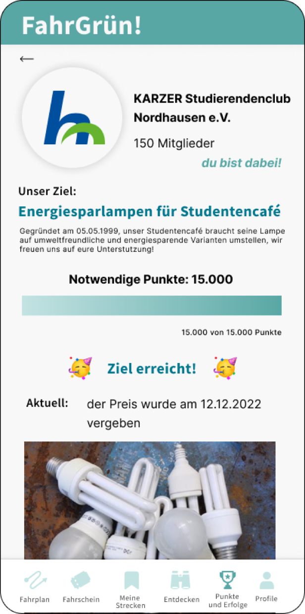
In addition to earning points, users can also redeem their points for social projects. Users can donate their points to community projects such as planting trees, building a eco-friendly playground, cleaning up local parks, or supporting sustainable transportation initiatives. This feature will help to build a sense of community among app users and encourage them to use sustainable modes of transportation more often.
The rewards help to motivate users to continue taking public transportation and earn more points.
Objective
To create an inclusive and responsive App that increases the motivation of users to take public transportation by rewarding local social projects.
A big conclusion for our team was that people still want to keep their cars, so we are focusing on increasing the use of public transportation as an option.
Time Frame: March 2022 – March 2023
Client: Nordhausen County
Role: UX Design, UX Research, UI Design
Tools: Figma, Adobe Creative Cloud, Google Forms