Project Description
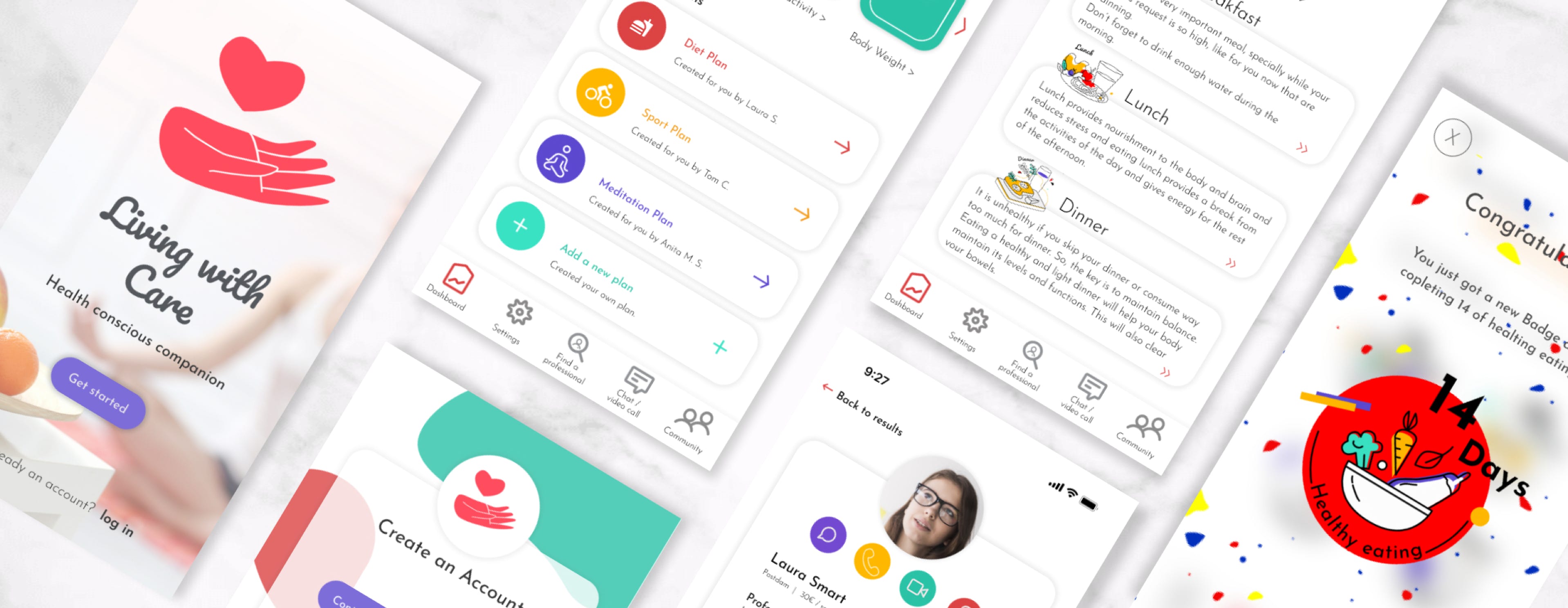
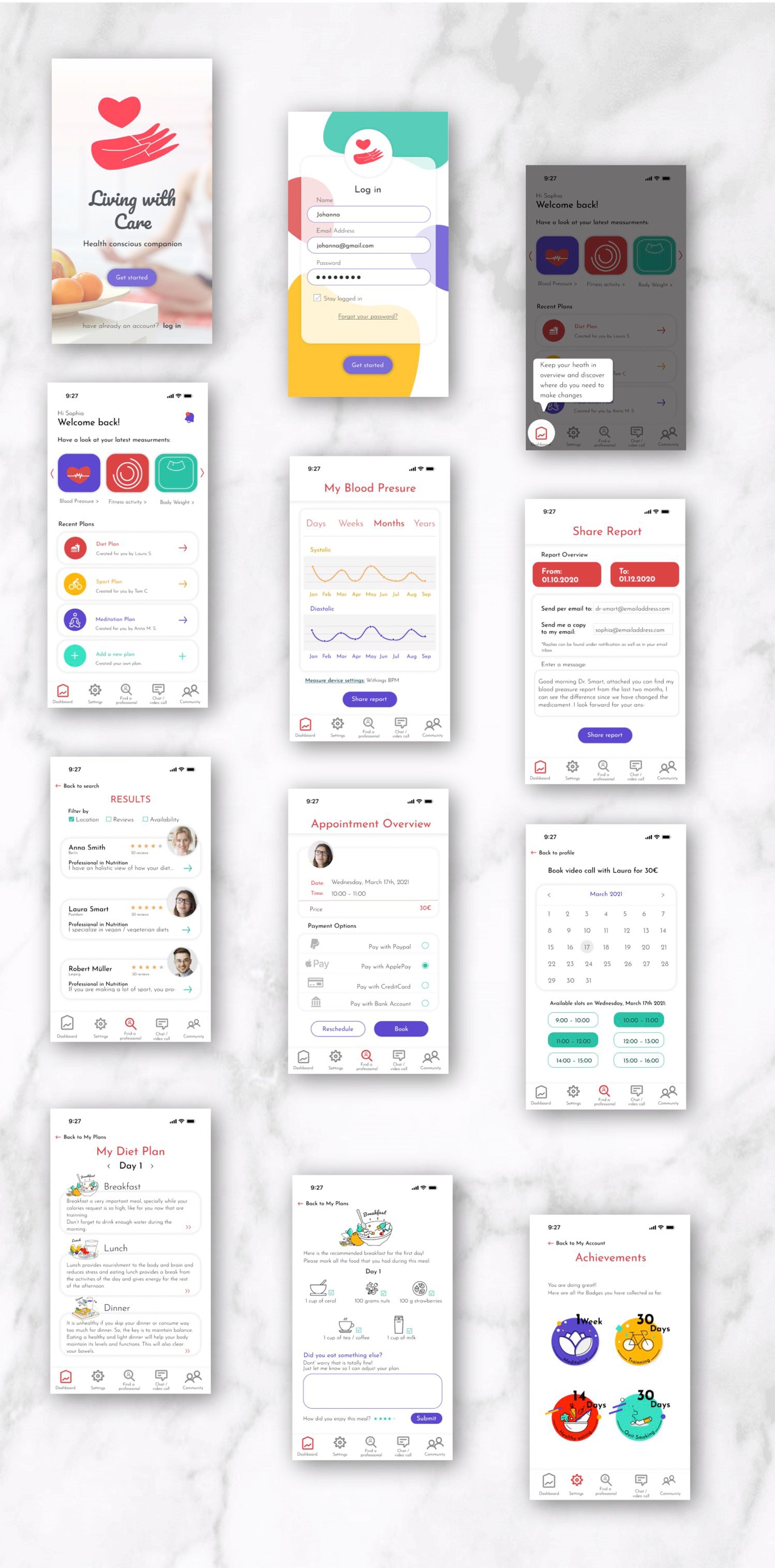
Living with Care, is an app that helps users to be aware of their body condition and habits. Thanks to the synchronization of available fitness devices, users get among other things, an overview of their physical activity or body condition, they can share this information with their doctors and even contact other health professionals through the app for a personalized program.
Objective
To create an inclusive and responsive App that allows users to monitor the body activities and other body vital signs and communicate directly with a health professional to clarify their results, get feedback or suggestions. Making this app will increase the value of feeling in companion while using it and not only monitored.
Time Frame: September 2020 – February 2021
Role: UX Design, UX Research, UI Design
Tools: Figma, Adobe Creative Cloud, Google Forms
Methodology
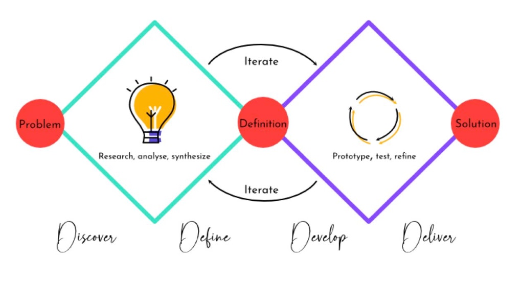
My journey during the design process is a non-linear practice, where information was gathered, hypothesis and goals were set, review, rewrote, developed, and tried again before creating visuals, and reviewing them again.
COMPETITIVE ANALYSIS
The analysis I ran included different apps that I found interesting, some of them included a chat option, had interesting graphics, or focused more on the fitness output.
I follow the SWOT model (Strengths, Weaknesses, Opportunities, and Threats) as well as a UX Analysis.
KEY FINDINGS
- Existing apps offer a variety of options
- Chat options are very mechanical, not a real human conversation
- Apps can gather information or provide plans, but not both
- Graphics and illustrations could be very attractive but very distracting at the same time, moving users attention from their main focus
OPPORTUNITIES
Health-related apps have been increasing popularity among users. The situation during the Covid-19 Pandemic made a big part of the population to be more aware of their health, lifestyle, and habits.
On the other hand, users are trusting more of digital services that can be achieved from home.
UNDERSTANDING THE USER
Analyzing user's behavior is a very important stage in the UX Design process. We can have an idea of a problem, but we can not be sure exactly what is what users want, what are their pain points and what they enjoy until we talk with them.
During the user research I run different tests, including interviews, surveys, card sorting, and show participants low fidelity prototypes to hear their feedback and prove or change my hypothesis of possible solutions.
KEY FINDINGS
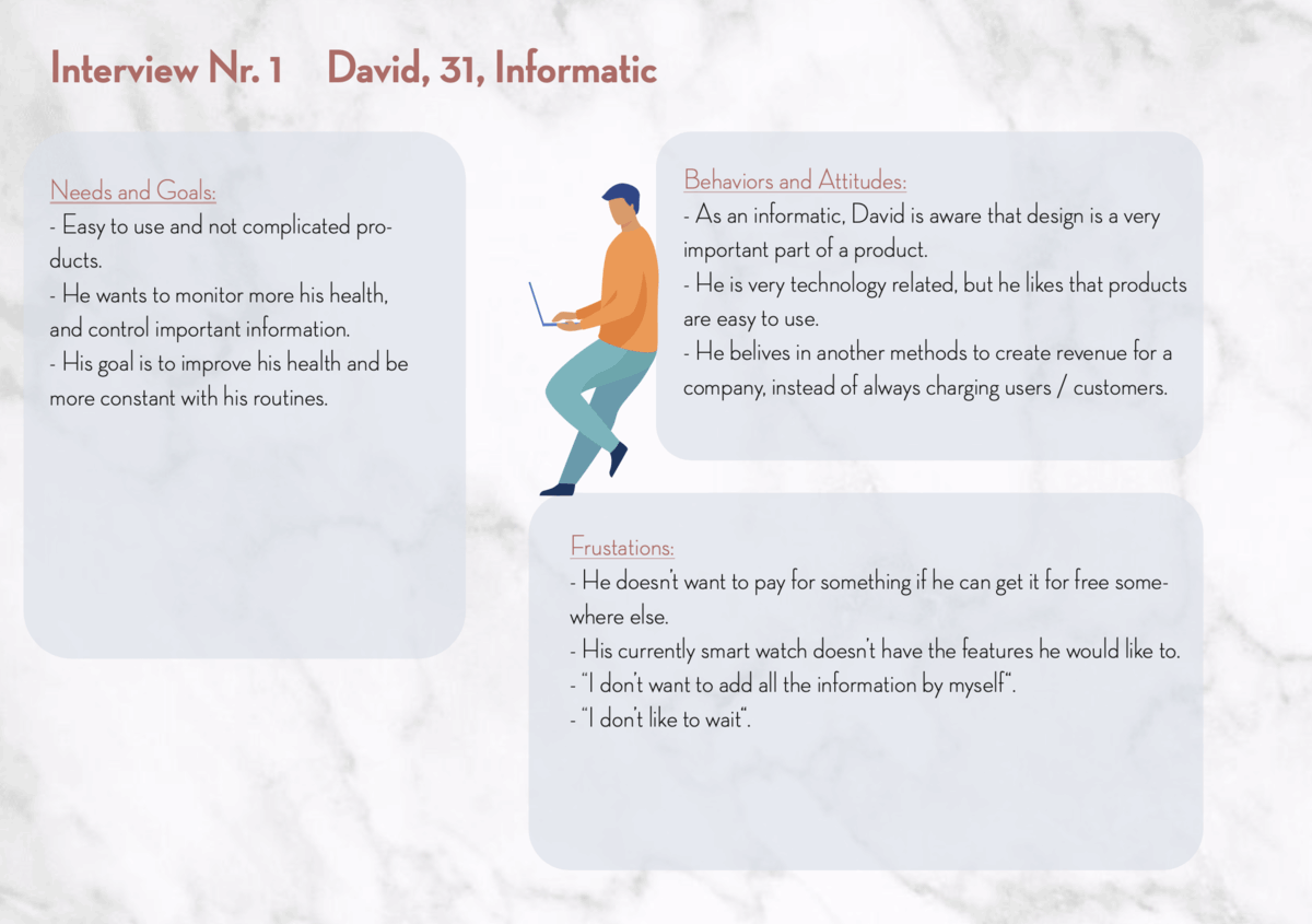
- Even when participants are not using apps to track their health activity and data every day, they were interested in the possibility to have personal access to a health professio- nal without going to their office.
- mostly all interview participants had an interest in the health fitness feature that allows them to chat with a professional, they were just concerned if it could help on every occasion.
USER INTERVIEWS AND AFFINITY MAPS
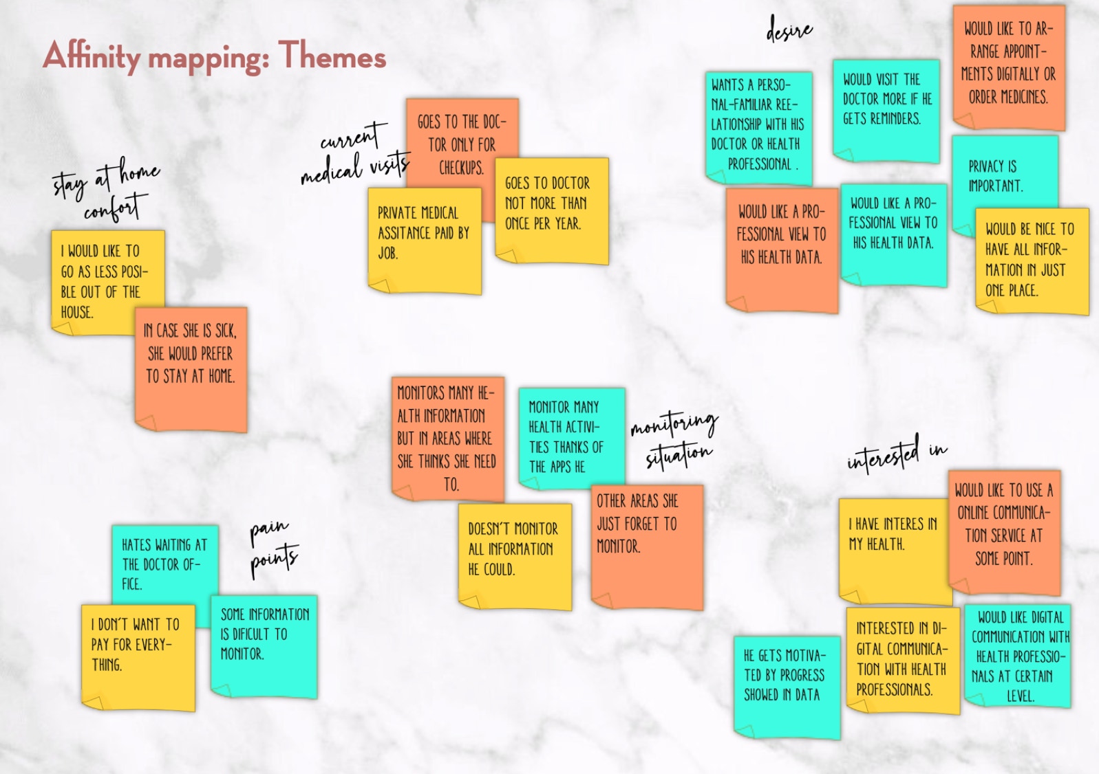
INTERVIEWS TAKEAWAYS:
After analyzing the different answers from the interview as well as the survey’s results, I have found some important points:
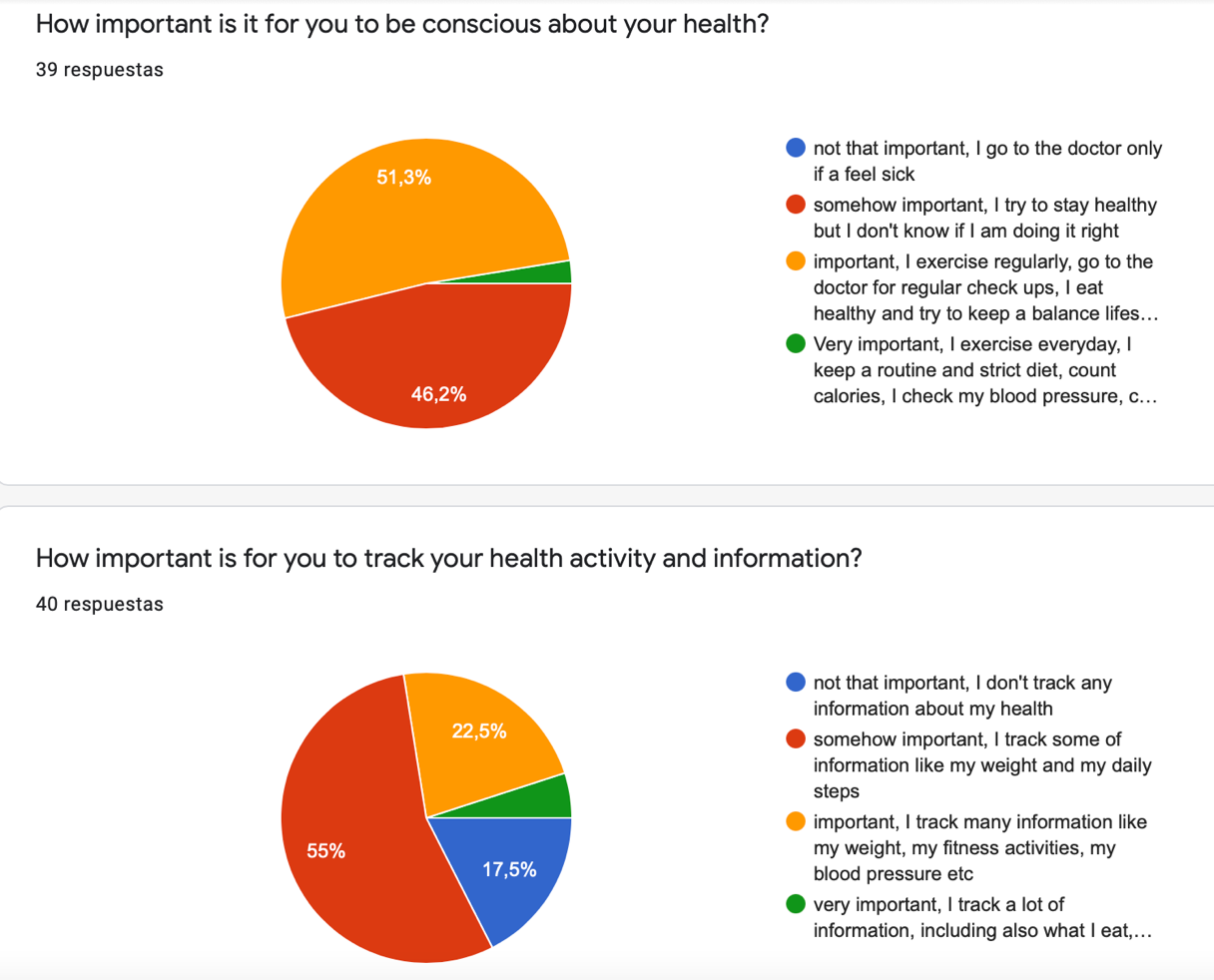
- Big number of users (interviews as well) consider health an important aspect of their life, but they don’t do a lot about it, even less, track their health activity or data.
- Many of them have an App but don’t use it very frequently.
After those insights, I can conclude that the target group for this product is very specific, and that the app couldn’t be promoted for „everyone“ but more for people that already take care of their health.
Taking that into consideration I found the following interesting insights:
- Users get motivated when they see the information that helps them tackle a specific problem, like sleeping in David’s case, and are more willing to engage to use the app or to do something about that issue.
- Users don’t like complicated ways to track information (food case).
- They would find it interesting to be able to chat with a doctor or health professional directly about the information they got in their app, the find also interesting the fact to reduce at some level the physical visits to consultation.
- They appreciate a personal and deep treatment.
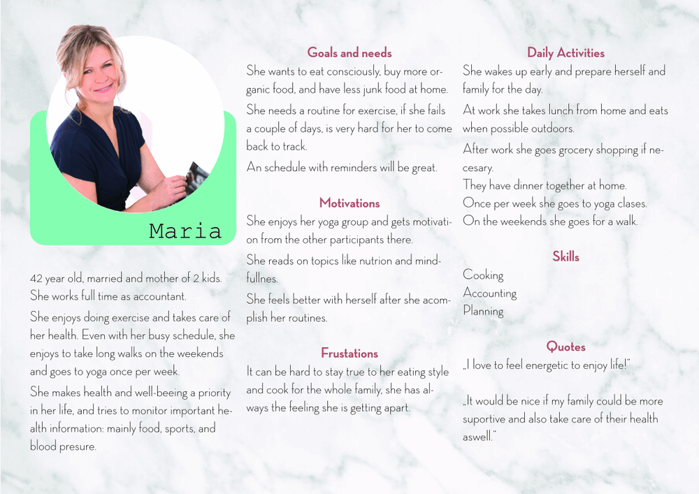
USER PERSONA
Based on my research and results from the user survey and interviews, I created four user personas to represent my target users.
The Personas were very important while continuing with the next design process.
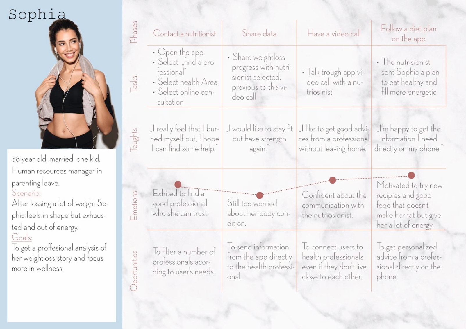
USER JOURNEY MAP:
Based on my Persona Sophia, I developed an User Journey Map, to visualize the process that she'd take in order to achieve her goals.
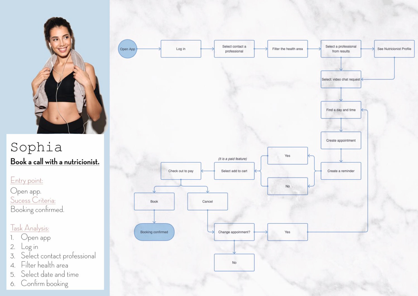
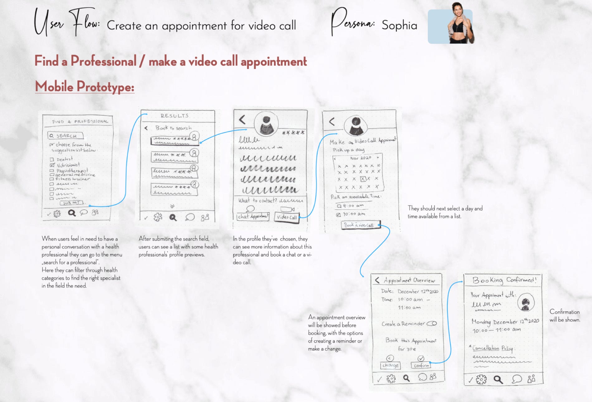
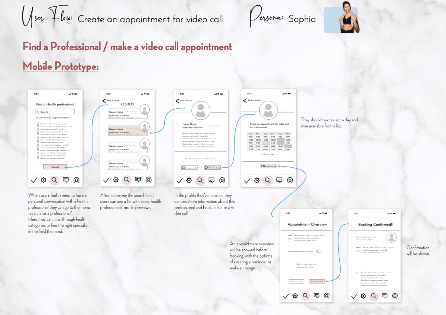
USER FLOW CHART:
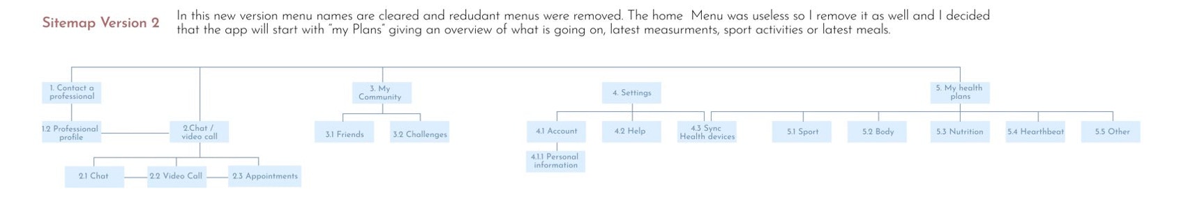
CARD SORTING & SITEMAP:
The input from participants who took part in this research method, help me to organize the information architecture of the app's content.
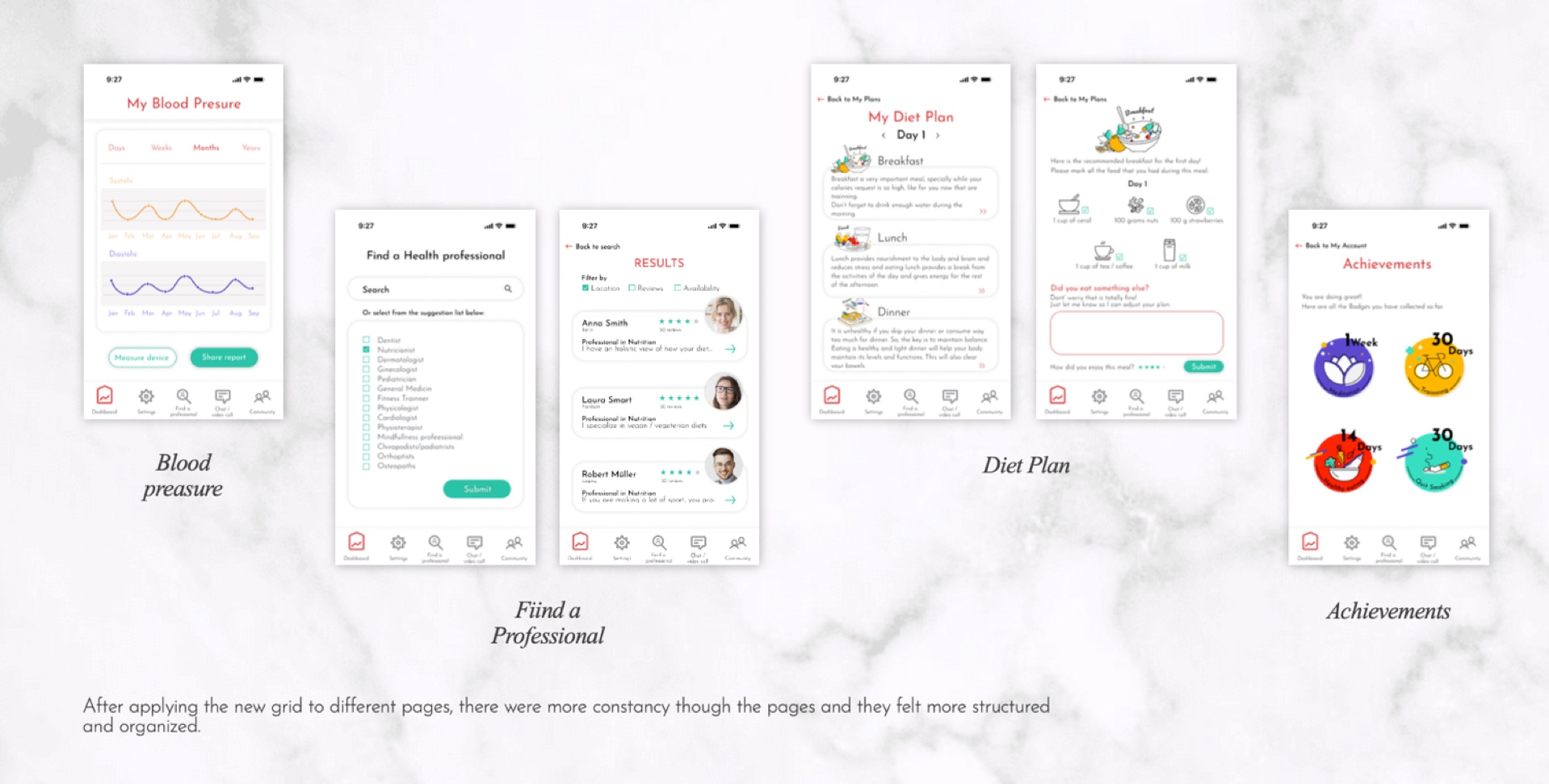
REDEFINING THE DESIGN:
Taking into consideration many of the suggestions from participants some changes were made in the Design.
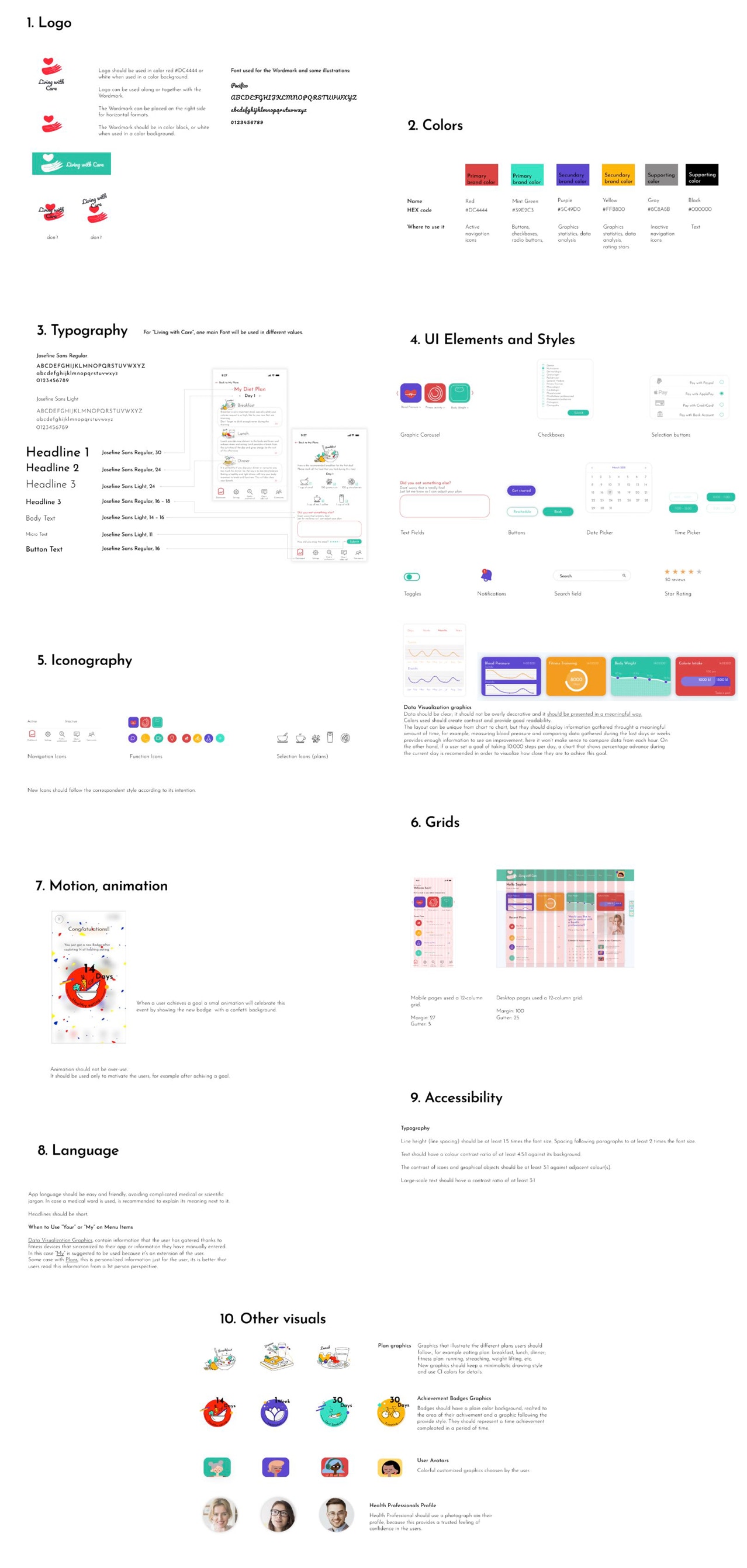
This process gave also very positive feedback concerning the visuals, so I started to create the Style Guide and Design System for the App.
Let’s get in touch! 😎
Feel free to contact me for project opportunities, or just to say hi!


